UX Case Study: Designing a Digital Sanctuary for Mental Wellness Apps
An in-depth look at crafting empathetic, calming user interfaces for mental health digital products.
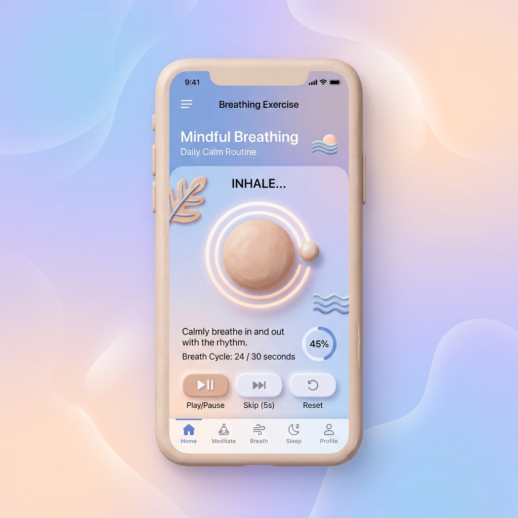
Quick Summary
Designing mental wellness apps requires empathetic UX patterns, calming color palettes, minimal cognitive load, and frictionless accessibility features.
Mental health applications occupy a unique space in digital product design. Unlike productivity tools that encourage speed and frequent engagement, wellness platforms must act as digital sanctuaries that promote tranquility and emotional safety.
Our design approach centers on reducing cognitive load through generous whitespace, soothing pastel color hierarchies, and gentle micro-interactions. Every UI element is crafted to prevent user overwhelm during vulnerable moments.
Accessibility is equally paramount. High contrast ratios, screen reader compatibility, and adjustable font scaling ensure that users experiencing anxiety or sensory sensitivities can navigate the platform comfortably.
Conclusion
Prioritizing empathy in UI/UX design builds deep trust with users, turning standard apps into indispensable daily wellness companions.
Frequently Asked Questions
What color palettes work best for mental health apps?
Soft earthy tones, muted greens, warm blues, and gentle neutrals help evoke calm and reduce visual stimulation.
How do you minimize user friction in wellness apps?
Keep onboarding short, provide clear progress indicators, and avoid aggressive push notifications.